Player Journey
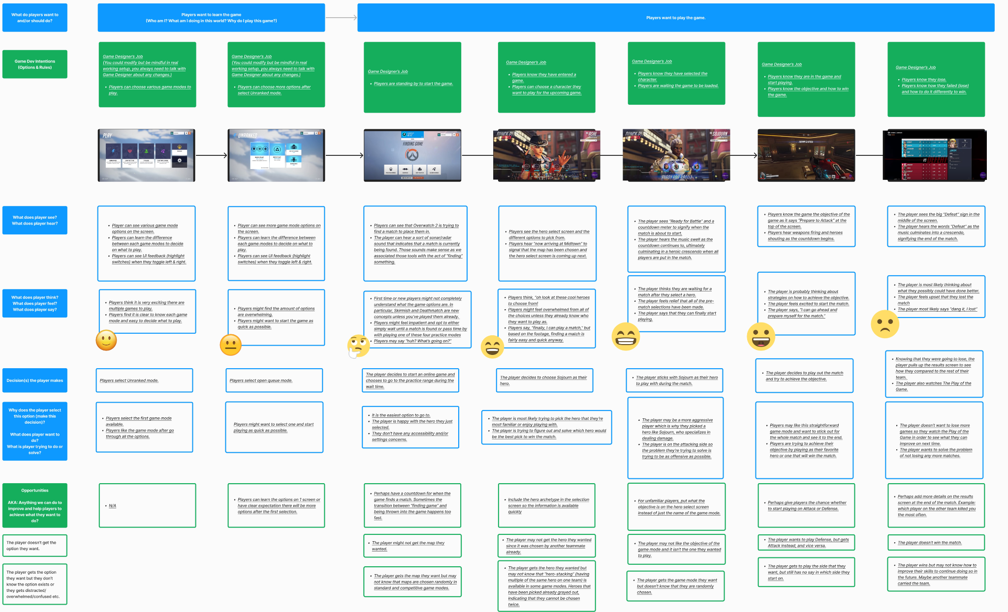
Paper Prototype & Flow Chart


ELVTR Gaming Portfolio Project
Client
ELVTR Gaming UX/UI with Blizzard design lead, Ivy Sang.
Brief
This case study focuses on Overwatch 2, one of the most popular esports. A game with over 20 million players, I looked to design a meaningful and cohesive player experience. This project contains player journey, paper prototype, flow charts, wireframes, usability tests, UI mockups, and accessibility tests.
Length of the Project
The length of the class and project was 7 weeks from January 11 to February 26, 2024.
Challenges
- Learning how to use Figma
- Refreshing previous knowledge of Photoshop and GIMP (self-taught)
- Time limit of 7 weeks to understand and learn UX/UI fundamentals
Wireframes
Home Screen
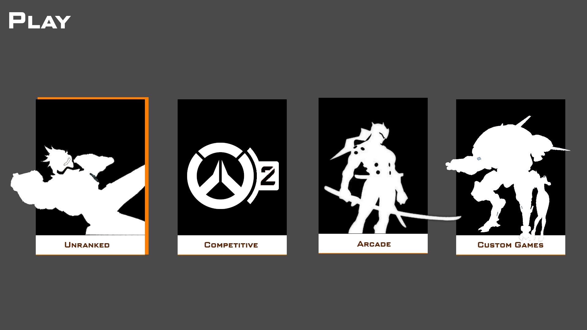
- Added an orange hue around the currently selected option for better visibility.
- Selected a gray background in order to contrast with the black game icons and white silhouettes.
Chracter Select Screen
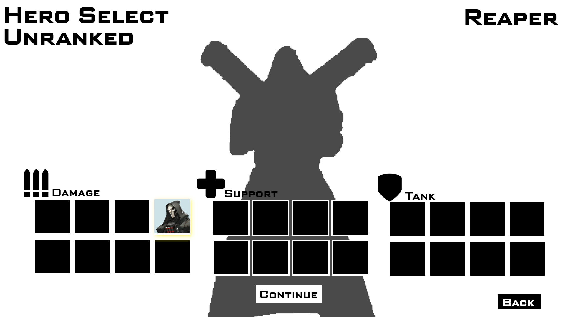
- Silhouette character became gray as to not clash with the black character select icons.
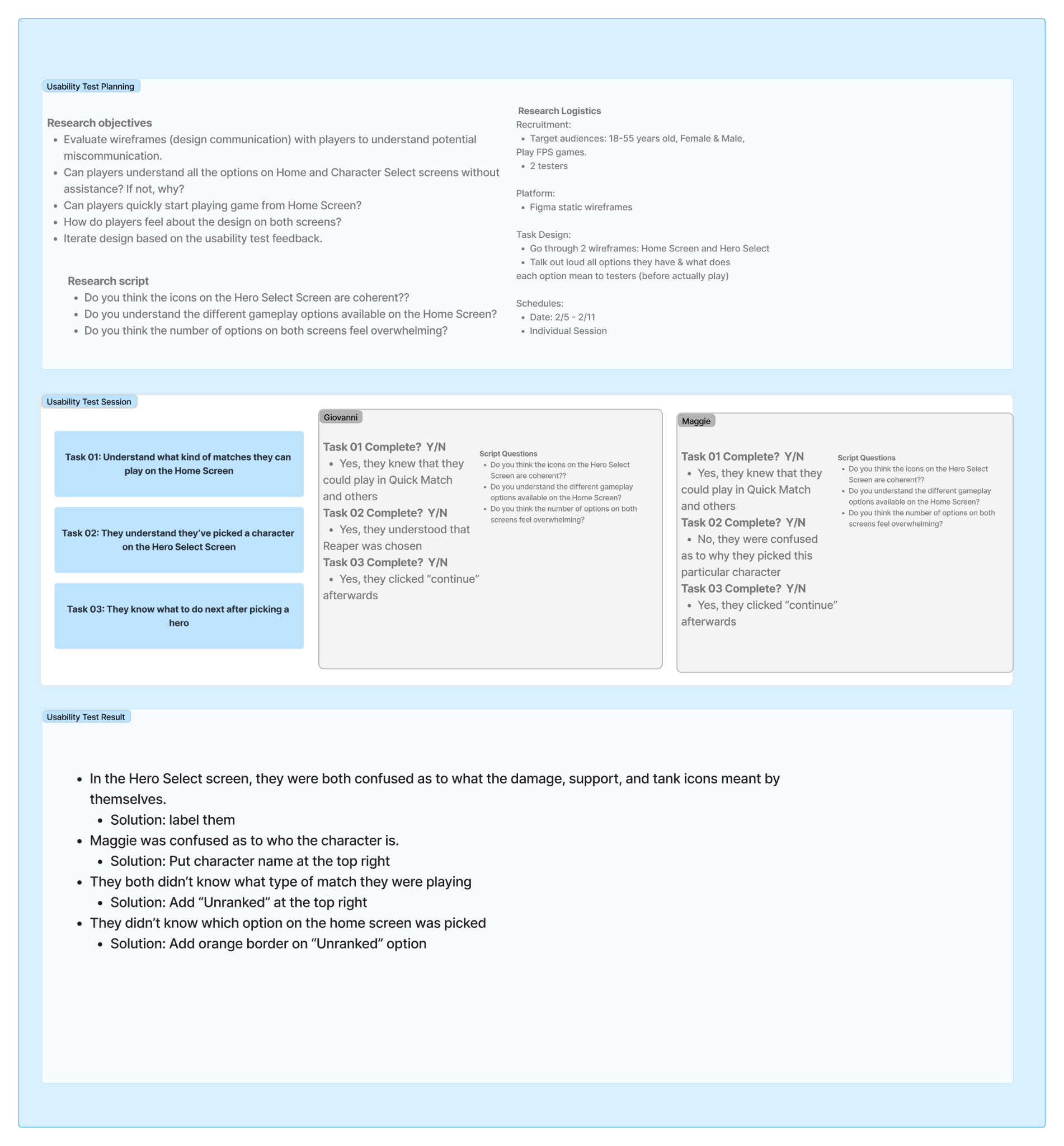
Usability Tests
UI Mood Board
Drew inspiration from various esports and battle royale games including Valorant, Apex Legends, and Call of Duty: Warzone.
Home Screen
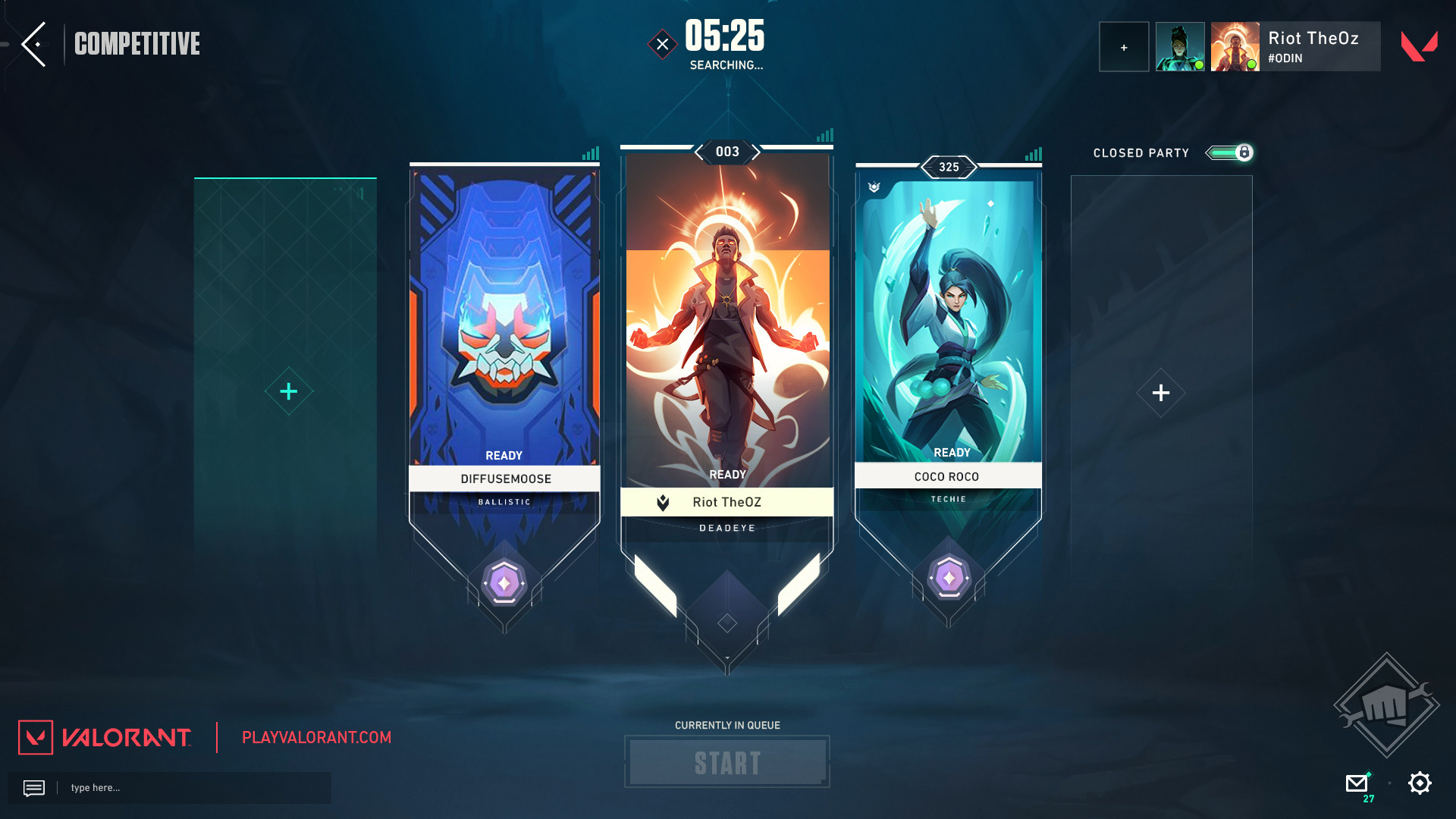
Valorant
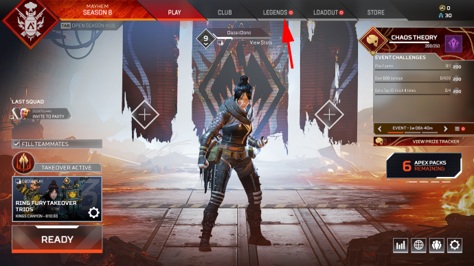
Apex Legends
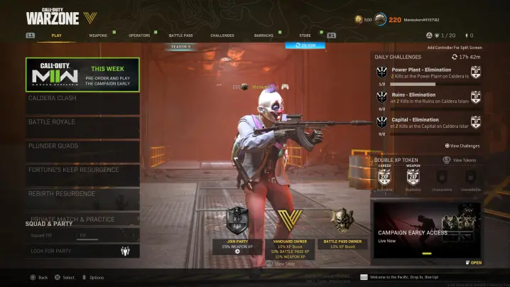
Call of Duty: Warzone
Character Select Screen
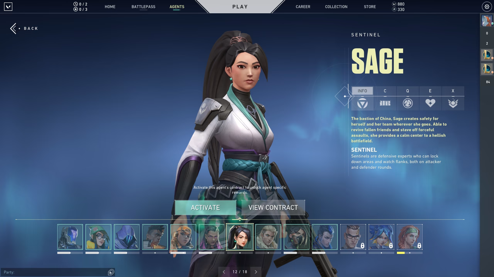
Valorant
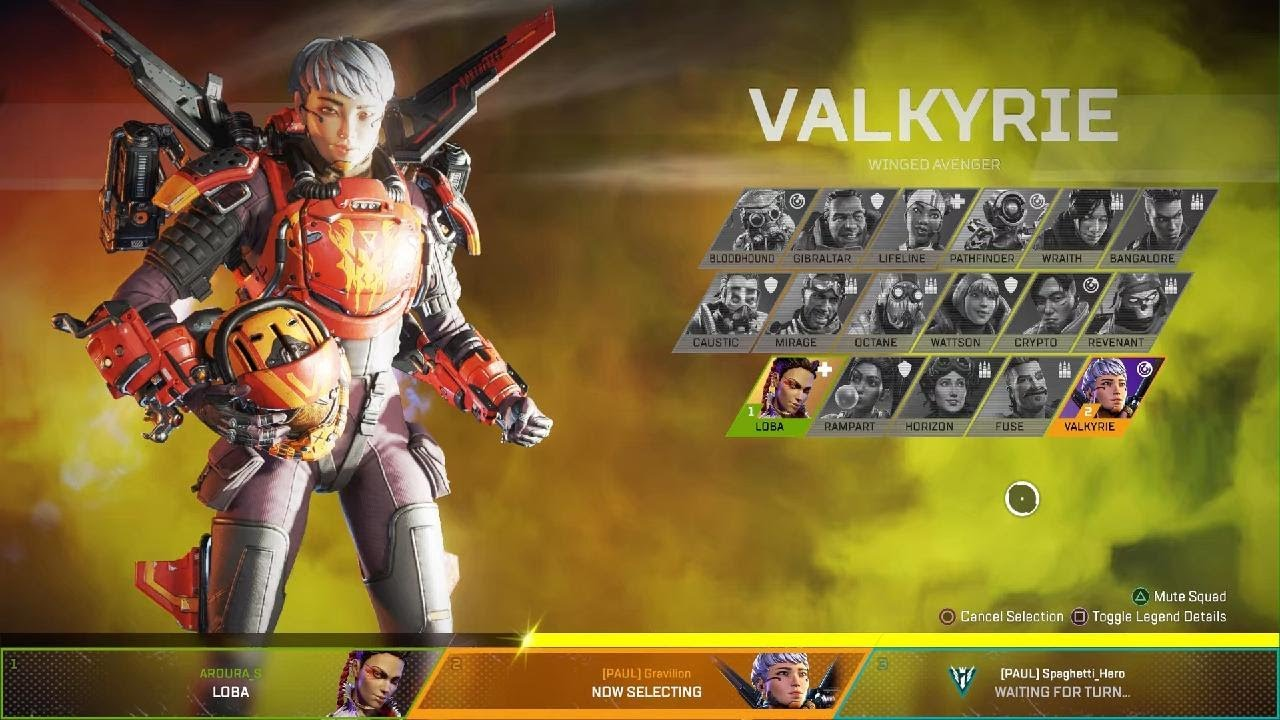
Apex Legends
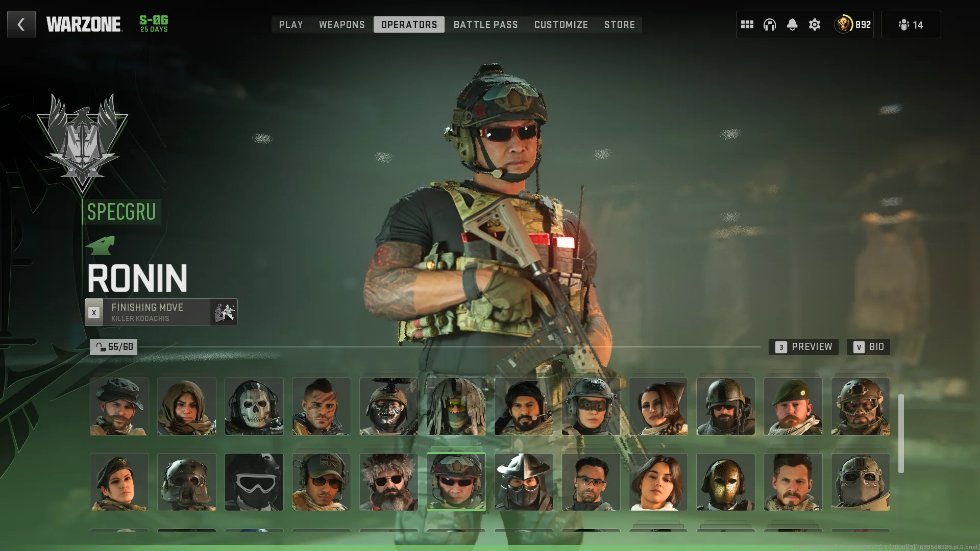
Call of Duty: Warzone
UI Mock Ups
Home Screen
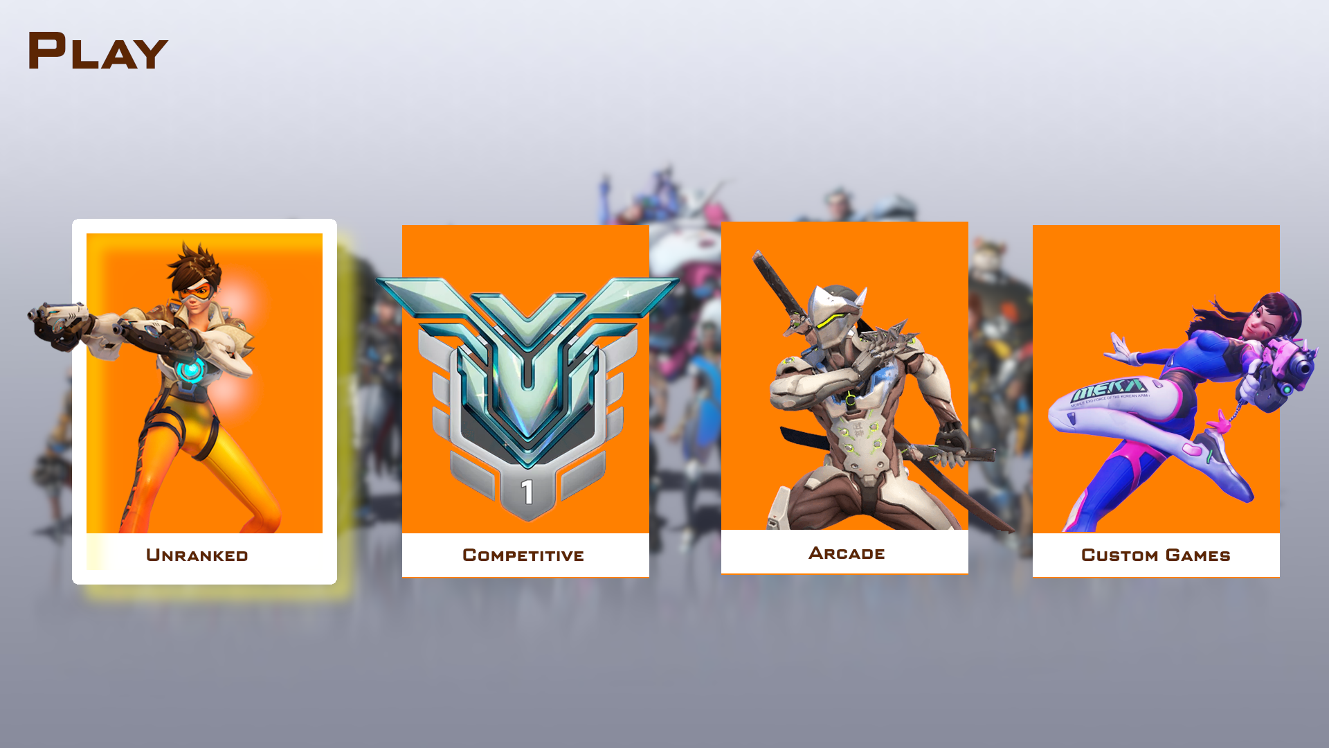
- Blurred background in order to make the game selection options pop out
Character Selection screen
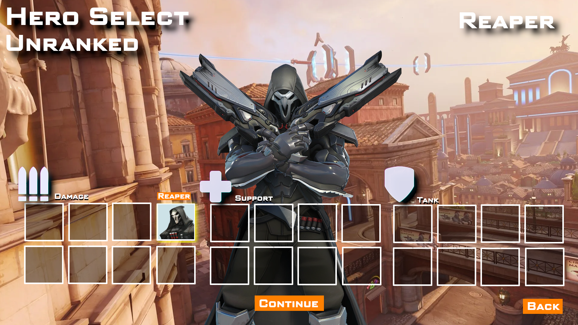
- Made the character select boxes transparent instead of all black as that reduces visual tension with the 3D character model
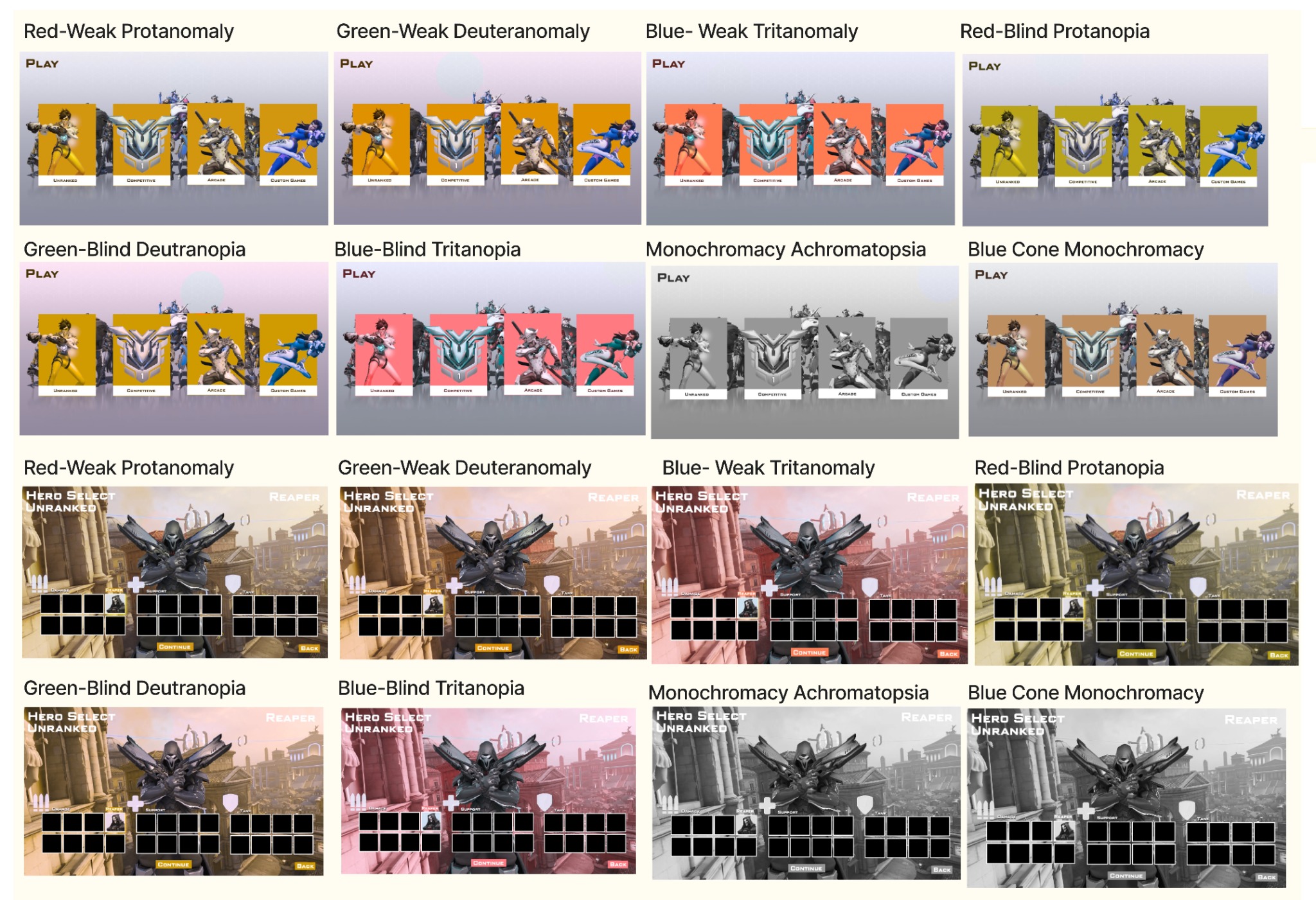
Accessability Testing
I put the UI screens through a color blindness simulator to check if they were any glaring problems. There were no significant or noticeable issues.
Conclusion
Throughout this project, I was given various projects to show to communicate with players through UX/UI design. Starting with the player journey, paper prototype, and flow chart, I mapped out how players would interact with that game. Through the wireframes, UI mock ups, and accessibility tests, I came to see how players visualized their journey.
Positive results from usability and accessibility tests substantiates the proposed changes made through the project and improved player experiences.
